id738601362
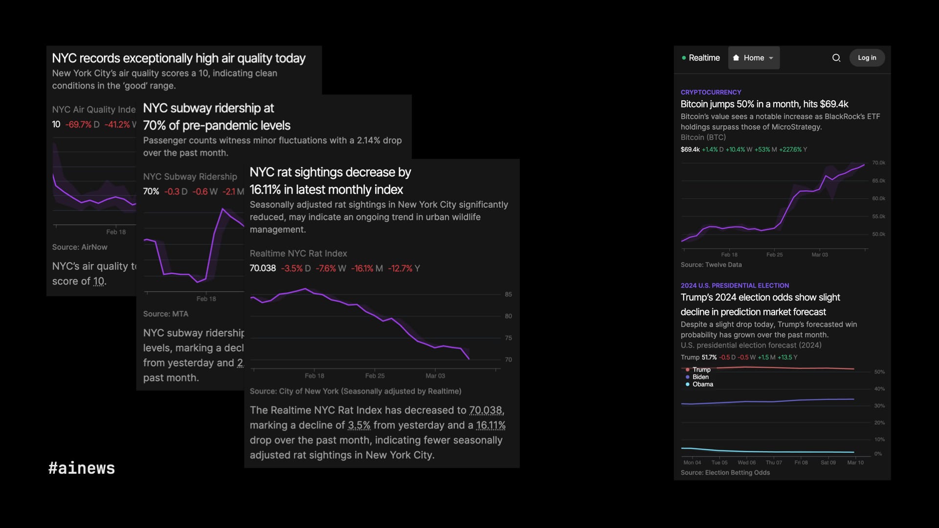
Link to originalIt’s called Realtime, a news site, by Matthew Conlen and Harsha Panduranga, that charts regularly updated feeds of data from financial markets, sports, government records, prediction markets, public-opinion polls, etc. The data and charts are fully automated. The site tries to highlight charts that are showing interesting data, like an outlier, or particularly strong growth or decline. So far, cool but basic math.
Where LLMs play a role is in providing context: the headlines and other brief copy that appear around the charts to help readers understand what they’re looking at. The air quality in New York today is good, subway ridership is still below pre-pandemic levels, but on the bright side, our fight against rats is showing progress.